Travel Buddy
PROJECT TYPE
Concept
ROLE
UI/UX Designer
TIME FRAME
6 weeks
SCOPE
Research | Strategy | UI/UX | Prototyping | Testing
THE PROBLEM
Millennials prioritize travel more than any prior generation. 51% have gone into debt for summer travel. That’s more than 36 million Americans.
THE SOLUTION
Travel Buddy is a budget-first travel planning web application designed to help millennials travel more and spend less.
1. Empathize
User interviews | Secondary Research | Competitive Analysis | Surveys | Affinity Mapping | Persona Development
-
My goal was to understand the motivations, problems, and feelings of millennial trip planners. This stage of the process was extremely important in informing the definition and design of the solution.
-
Starting with five interviews with international trip planners, I began to uncover problems surrounding their struggles with budgeting and planning.
I moved on to secondary research and uncovered the magnitude of the relationship between travel and budgeting. Through competitive analysis, I found that although there are many players in the travel space, no one was specifically addressing this problem.
Next, through an affinity mapping exercise, I developed patterns in my research. I then surveyed 30+ international travelers on the patterns I uncovered to hone in on my findings.
My final deliverable came in the form of a persona, which I used to guide the definition and development of the solution.
-
My research developed into two patterns:
Millennials will go into debt to travel. 61% struggle to stay within their travel budget. This was the biggest stressor in their planning experience.
Millennials lack the time and expertise needed to plan their trips. Although they can find plenty of travel information online, they find it difficult to narrow it down based on their wants and needs.
2. Define
POVs & HMWs | Ideation | Storyboarding | Prioritization | Roadmapping
-
From my research and persona, I came up with a single question to inform the ideation & definition of the solution:
How might we help busy and financially-stretched millennials find unique, budget-friendly destinations and itineraries?
-
My first step was sketching and ideating a variety of solutions to the problem. I then pulled the best two ideas into quick storyboards and ran these concepts by a few of my interviewees for feedback. Based on their suggestions, I settled on the idea of a budget-first travel planning solution.
Next, I developed a Venn diagram with business goals, user goals, and technical considerations to find overlap. Finally, I broke down the idea into a feature set, which I prioritized based on the data I uncovered during my research. The resulting roadmap informed the development of the solution.
-
Travel Buddy is a budget-first travel planning web application designed to help millennials travel more and spend less.
How it works:
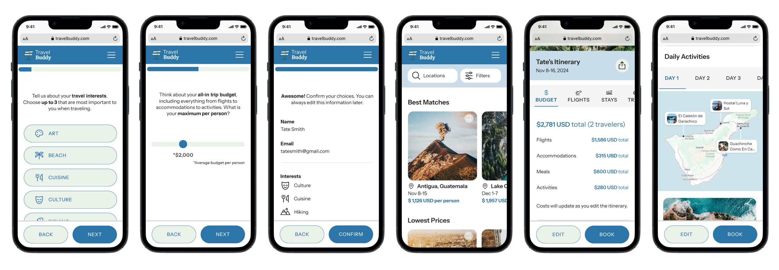
Users take a short quiz to build their travel profile with their dates, travel interests, and travel style.
The web application outputs global destinations within their budget and interests.
Users can click on the destination they are interested in to find out more and edit pre-built itineraries.
Throughout their experience, the outputs must be budget-first, customizable, personalized, and shareable.
3. Develop
Information Architecture | Task Flows | User Flows | Lo-fi Wireframes | Digital Wireframes | UI Design
-
My goal was to design how a user will experience and interact with the solution through a variety of prototypes, moving from concept to sketches to high-resolution.
-
Beginning with the information architecture, I used a content-first strategy to ensure that a user would have access to all the information they needed on each screen. Since my design would be very process-forward, building out the task flows and user flows was key to developing the user’s experience with the solution.
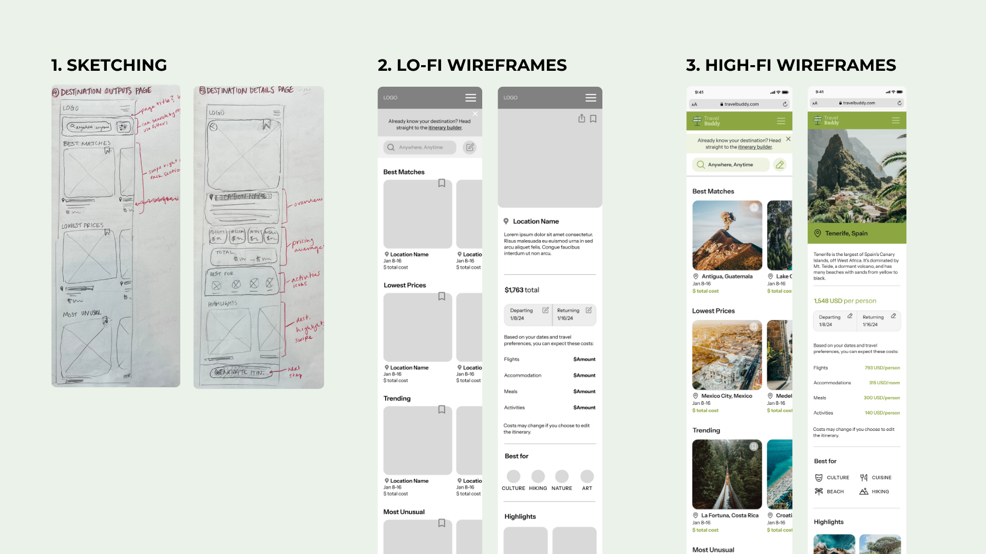
Next, I began sketching my screens by hand so that I could make quick changes and experiment with a variety of ideas. I then digitized my best sketches into lo-fi wireframes in Figma, influenced by design patterns familiar to millennials, like those of Uber Eats and Airbnb.
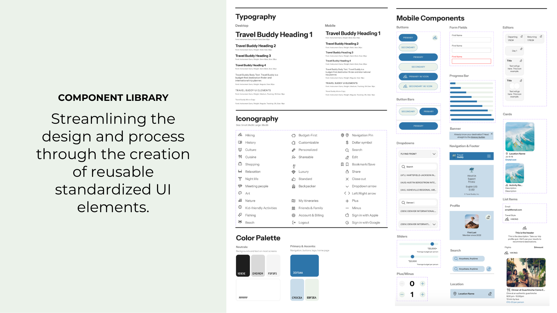
My next step was the UI design. Starting with a moodboard, I developed the typography, color palette, and UI elements that would be appealing to millennials. I created a component library to ensure the design and experience would be memorable, easy to use, and consistent.
Finally, I used the component library, typography, and palette to create the high-fidelity prototype for testing.
4. Test & Refine
Interactive Prototype | Usability Testing | Prioritization | Iterations
-
My goal was to test the efficiency, learnability, and satisfaction of the interactive prototype with 6 millennial users in order to prioritize updates to the design.
-
My first step was to turn my high-resolution design into an interactive prototype to conduct usability tests. The task flow I would be testing is: a new user visits the platform to find a destination and accompanying itinerary within their budget.
Next, I conducted 6 remote usability test sessions with millennial users. My goal was to collect:
Qualitative feedback using observation and ‘think out loud’ tactics to understand the feelings, thoughts, and attitudes of users
Quantitative feedback, including objective, numerical data to identify patterns and generalize findings
Following the tests, I used affinity mapping to find patterns in the data and prioritize updates to the design.
-
Along with some smaller changes, the major updates I prioritized based on the tests were:
Adding an option to “sign up later” so that a user can preview the experience without being forced to sign up
Adding an option to choose trip dates while setting up the trip profile
Updates to copy and iconography for confusing buttons and search function
Updates to the color palette
Final Thoughts
-
This was a conceptual project with the following business goal: We are developing a new responsive web application to address a problem people face when planning international trips.
Based on my research, including interviews, surveys, and usability tests, I believe that Travel Buddy addresses the problem that millennials will go into debt to travel.
During usability tests, 3/6 participants unprompted expressed that they wished this solution was real because they would definitely use it! The design has the potential to address a problem for over 36 million Americans.
If I were to take this project a step further, I would test it with a bigger pool of both millennial and gen-z users as a working, but very basic proof-of-concept.
-
This was my very first end-to-end UI/UX design project so I am very proud of the work I’ve done!
My key takeaways from this project:
Testing low or mid-fidelity prototypes might be more ideal for working faster. There isn’t a need to be pixel-perfect when doing usability testing.
I’d like to become more particular with my methodology for future projects. This project in particular was meant for learning a diverse set of design practices, but now I am able to understand which processes are best to use for specific design goals.
Design happens in so many ways outside of Figma, from designing research to information architecture.
Collaborating with engineers would add a new layer to this work. As a prior product manager, I know how important it is to work jointly with a greater team, but since this was a conceptual project, I didn’t have that opportunity.
-
Tight timeline: Rather than perfecting every idea, I tested with users throughout.
Working solo: I bounced ideas off of travelers, my mentor, and with other designers while ideating and designing.
Small Data Pools: In addition to interviews, I backed up my learnings with secondary research and surveys.


