Weezie’s Boutique Hotel
PROJECT TYPE
Website Redesign
ROLE
UI/UX Designer
TIME FRAME
2.5 weeks
SCOPE
Research | Strategy | Branding | UI/UX | Prototyping | Usability Testing | Project Management

-
The Problem
Guests frequently struggle to find desired information on the Weezie's website due to cluttered navigation and dense content. Furthermore, guests find it confusing to differentiate between room types and struggle to book their preferred accommodation, often getting lost while navigating between tabs and pages.
-
The Solution
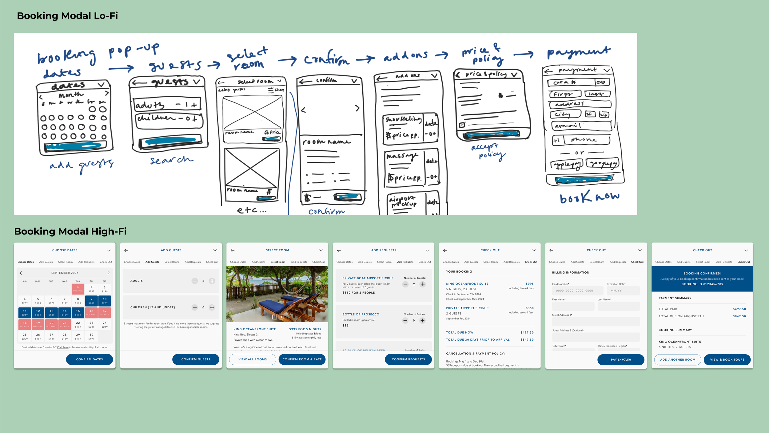
A streamlined booking process was implemented, integrating a popup booking modal directly within the website. Brand identity representation was enhanced across the landing page and rooms pages, while the site map and navigation were simplified for an improved user experience.
Key Features
Hover over or click on the pink buttons to learn more or click here to open the prototype in a new tab.

Impact
Following usability tests, bookers reported a 10/10 ease of booking and 9.5/10 overall satisfaction with the site.
Here is what they had to say:

-

“Booking was easy! That’s a ten. No questions, no challenges!”
— James
-

“It really appeals to me. The whole vibe about it is what I really like and it was definitely apparent in the branding. It's the kind of place where I'd love to stay.
— Laura
-

"Oh, this is so much better! I really like how the booking window pops up now. It saves me a lot of hassle from switching between tabs."
— Kimberly

Process
Empathize | Define | Develop | Test & Refine | Reflection
1. Empathize
Competitive Analysis | Secondary Research | User Interviews & Usability Tests | Affinity Mapping | Persona
-
Identify how users navigate the current website to find information and book rooms, pinpoint any challenges they encounter, and determine their needs, preferences, and expectations when booking boutique hotels.
-
Conducted user interviews and usability tests on the current site with 5 boutique hotel bookers to understand user needs and pain points.
Conducted competitive analysis on nearby hotels with similar price points to identify market positioning, strengths, weaknesses, and opportunities for differentiation.
Performed secondary research on tourism in Belize and, more specifically, Caye Caulker, to gain insights into local tourist preferences, attractions, and trends.
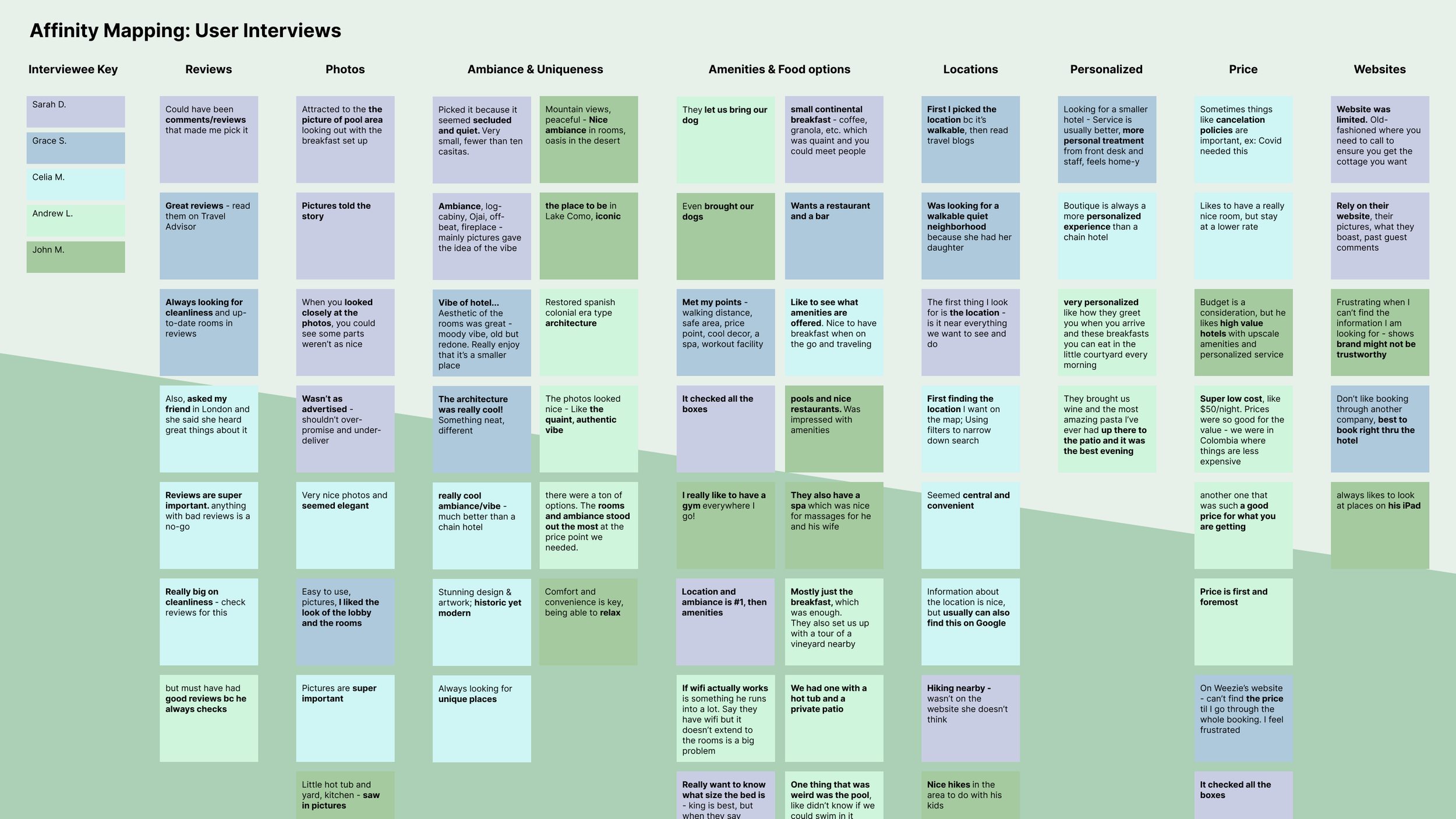
Identified key patterns from interviews via affinity mapping, such as the importance of first impressions and a desire for a simplified booking process.
Created a persona based on secondary research and interviews to drive the design and development process.
-
Boutique hotel bookers seek easily accessible pricing information on hotel websites, prefer direct booking for security, and prioritize brand trustworthiness.
Bookers face usability challenges navigating the current website due to booking complexity, cluttered navigation and dense content.
Bookers prioritize hotel uniqueness, focusing on room aesthetics and ambiance, often gauged through hotel photos.
They favor authentic experiences, paying attention to location, safety, and walkability.
2. Define
POVs & HMWs | Project Goals | Roadmap | Site Map | User Flows
-
My objective during this stage was to translate research insights into a clear roadmap for design and development. This involved clarifying project goals and determining the overall project direction to enhance Weezie's boutique hotel website experience.
-
Developed Point of View (POV) and How Might We (HMW) statements tailored to Weezie’s challenges.
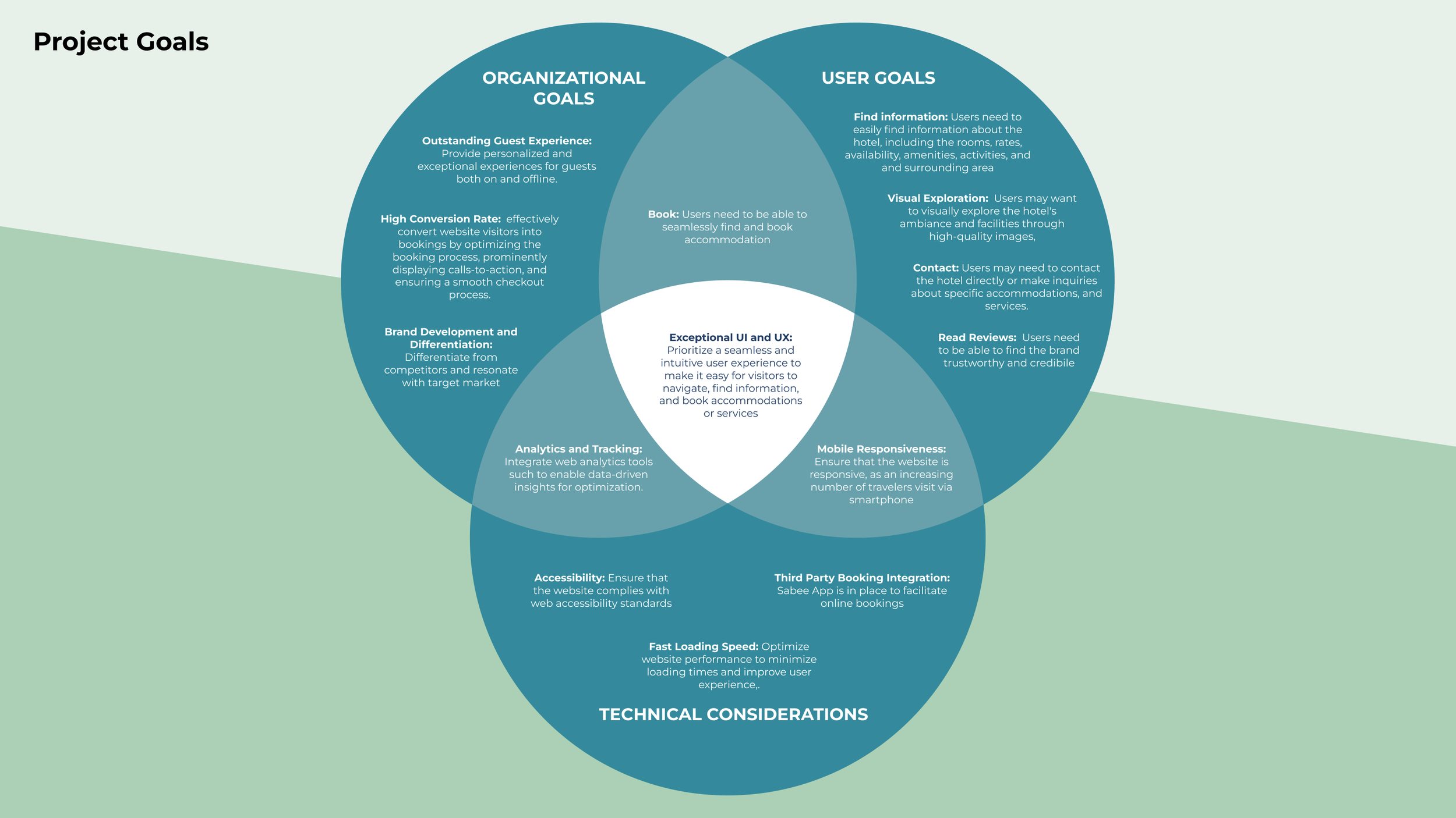
Established project objectives, aligning user goals, organizational objectives, and technical requirements.
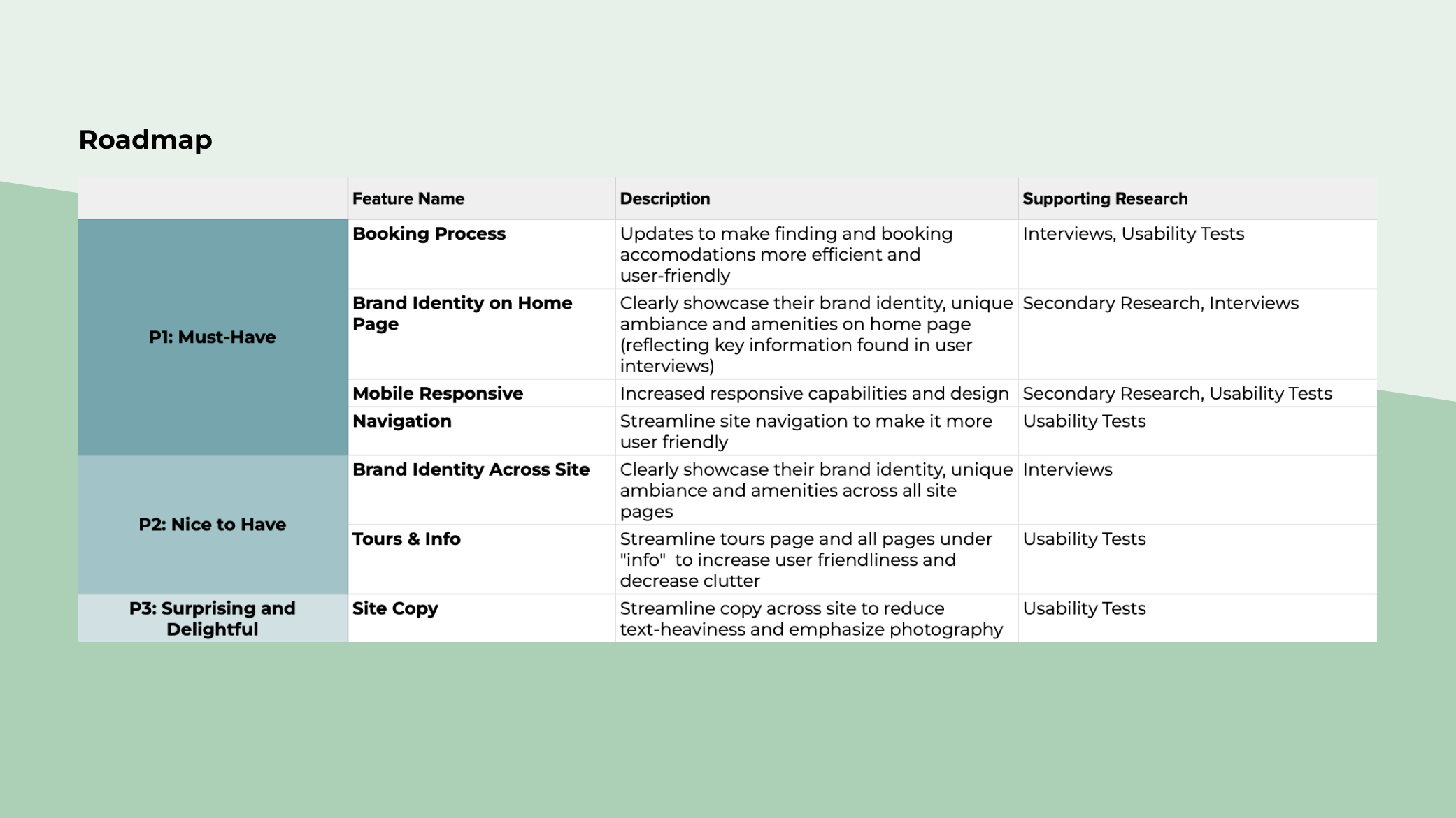
Developed a roadmap prioritizing key features for implementation, informed by persona insights and research findings.
Revamped the current site map using card sorting methodology with select users to streamline navigation and improve intuitiveness.
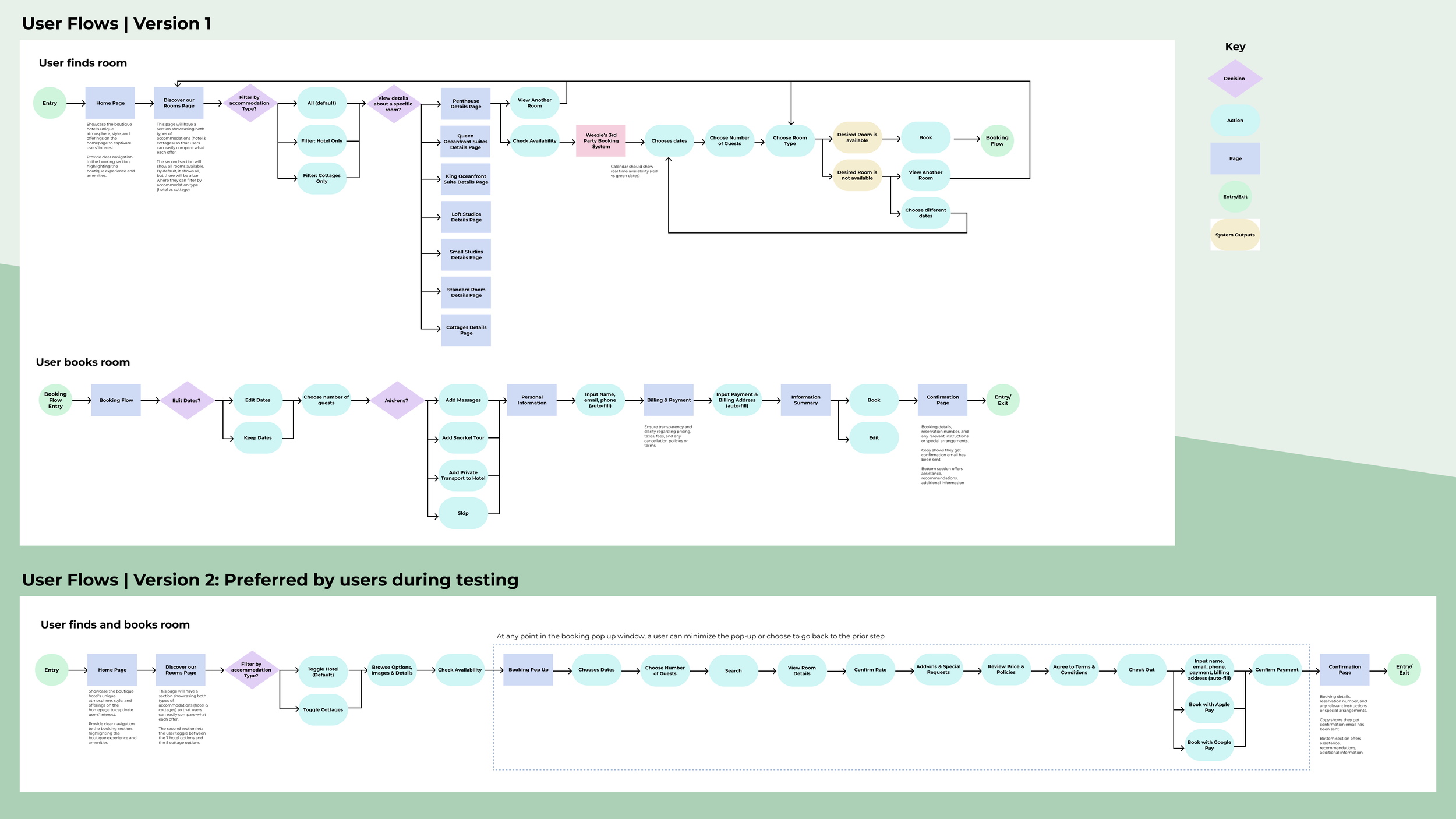
Crafted two user flows to explore alternative solutions, then tested with users to determine the optimal approach.
3. Develop
Low-Fidelity Wireframes | High-Fidelity Wireframes | Clickable Prototype | Style Tile | Components Library
-
Throughout the development stage, my objective was to quickly transition from low-fidelity to high-fidelity designs while iteratively gathering user feedback. The final clickable prototype encompasses the entire booking journey, from the home page through checkout, providing users with a comprehensive experience of the brand and booking process.
-
Created iterations of lo-fi wireframes for user feedback and experimented with Procreate for sketching.
Developed a style tile and components library, integrating a new iconography set, the hotel’s photography, and updated typography and - color palette.
Designed the high-fidelity clickable prototype with a focus on consistent brand elements, concise and updated copy, and high-resolution images for user testing.
4. Test & Refine
Usability Testing | Iterations
-
Usability testing and iterative refinement played a pivotal role in validating design solutions and fine-tuning the user experience. Through qualitative and quantitative feedback, I refined the design, addressing pain points and enhancing usability to deliver a seamless browsing and booking journey for Weezie’s guests.
-
Conducted usability testing with 5 users similar to persona to validate design solutions.
Gathered feedback on satisfaction levels and usability metrics.
Made iterative refinements based on testing results, prioritizing user needs and goals.
-
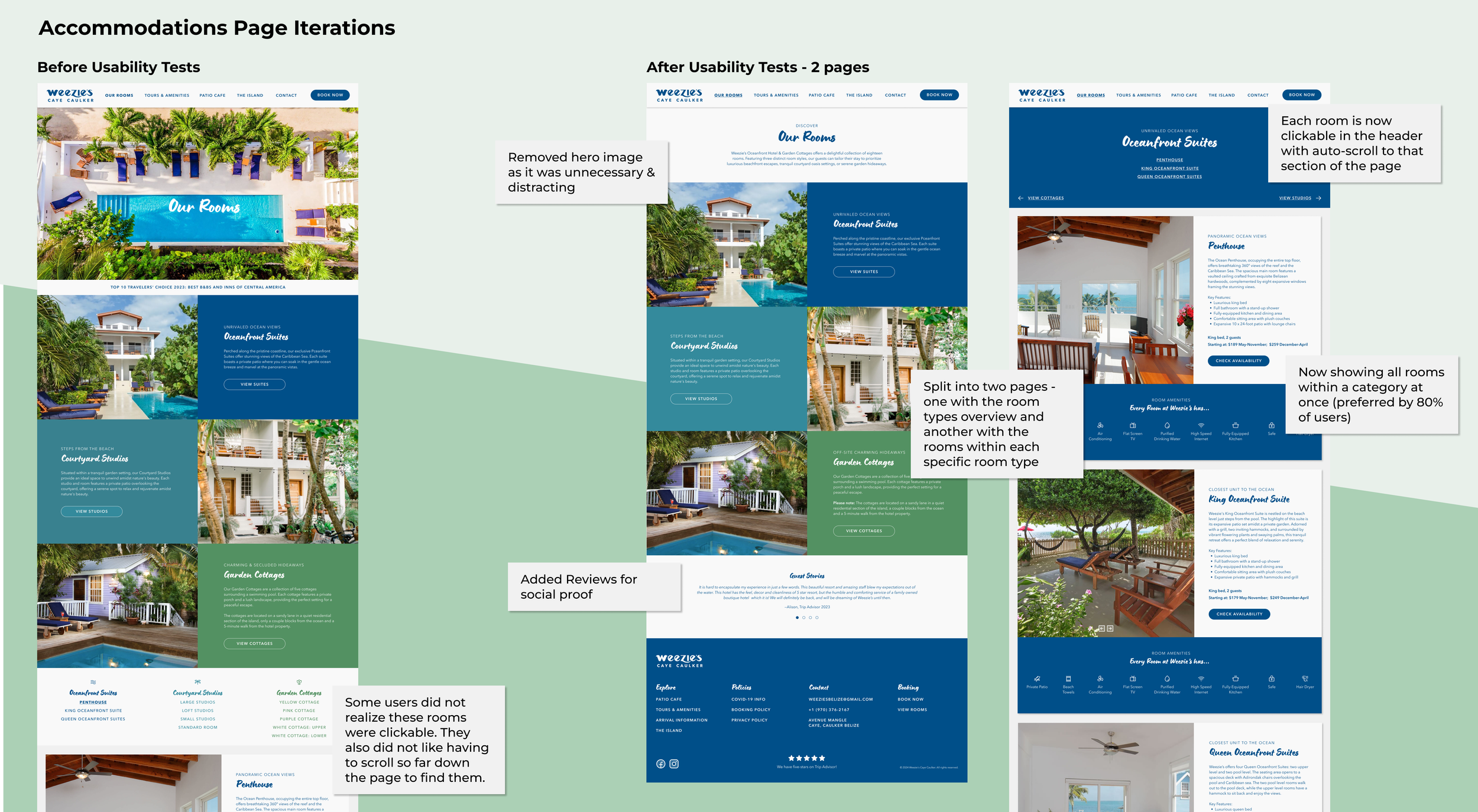
Based on overwhelmingly positive user feedback on the booking modal, I shifted my focus to refining the accommodations page, which presented challenges for a significant portion of users (with a 40% error rate). This involved reorganizing the rooms page into two sections to improve navigation and displaying all room options within each category simultaneously, as preferred by users.
Furthermore, I implemented several updates based on user observations and feedback:
Enhanced the visibility of the scrollability of the home page.
Condensed the homepage to mitigate the perception of an endless scroll by consolidating and removing sections.
Improved the visibility of image navigation arrows by enlarging them and adding a background.
5. Reflection
Final Thoughts | Next Steps
-
Regular check-ins with users were crucial. I prioritized rapid prototyping and user testing, quickly iterating through multiple design versions to gather feedback before moving forward.
Learning from the user first-hand, especially when refining features like the accommodations page based on usability tests, was paramount to the success of the design.
Moreover, this project allowed me to expand my design skill set. Exploring animation techniques and hover states, no matter how basic, made a significant impact on the overall user experience.
Overall, this solo endeavor has allowed me to hone my design skills in a real-world setting. I'm excited to apply these insights and techniques to future projects, continuing to create impactful and intuitive user experiences.
-
The next steps for this project entail implementing the P1 and P2 features outlined in the roadmap. This includes redesigning the remaining pages of the site with consistent branding and updated copy to ensure a cohesive user experience.
Moreover, I would plan to conduct ongoing user testing and usage analysis. By closely monitoring user interactions and behaviors, the aim is to iteratively improve the site, ensuring it meets the evolving needs and preferences of its users.


